Graphic Communication
Graphic Representation Techniques
Freehand sketching techniques
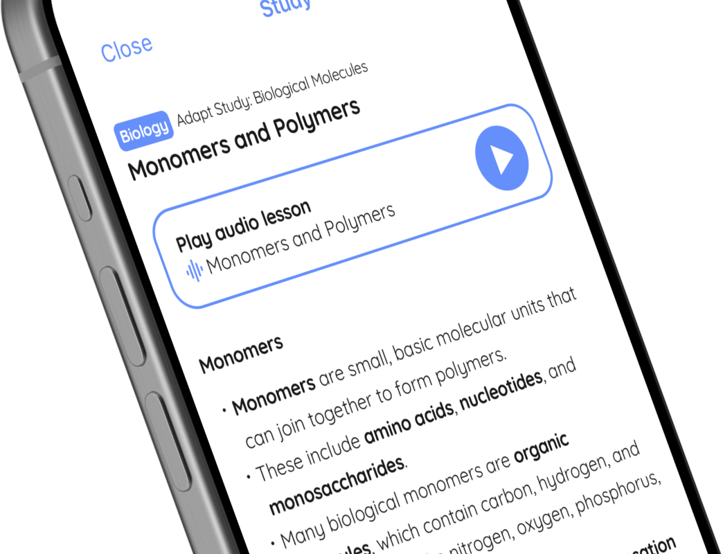
🤓 Study
📖 Quiz
Play audio lesson
Freehand sketching techniques
Freehand Sketching Techniques
Basics of Sketching
- The initial step should be about visualising what you want to draw.
- The purpose of freehand sketching is to provide a clear, rough approximation of an idea.
- Light initial lines are recommended. They can be erased or refined later.
- Understand your light source; shade accordingly to create more realistic sketches.
- Always start from simple shapes like circles, squares, and triangles, then add more complexity gradually.
Perspective in Sketching
- One-point perspective: All objects converge to a single vanishing point on the horizon.
- Two-point perspective: Objects converge to two vanishing points on the horizon.
- Three-point perspective: Objects converge to three vanishing points. This perspective represents a Bird’s eye or Worm’s eye view.
- Remember that lines representing the object's dimensions are parallel in reality, but in perspective, they converge.
Shading Techniques
- Cross hatching: Uses intersecting lines to indicate areas of medium or high density shading.
- Stippling: Shading technique that uses dots; more dots indicate darker areas.
- Smudge and smear: Soften the transition between different shading areas by smearing the pencil lead.
Enhancing Freehand Sketches
- Adding texture improves the realism of your sketch. It can make materials like metals, woods, and fabrics more recognisable.
- Annotations can help detail the function or important characteristics of a sketch.
- Arrowheads in sketches can indicate direction of movement or flow.
- Dimensions can be added to a sketch to communicate size or scale.
Common Mistakes
- Drawing lines too darkly at the initial stage restricts modification.
- Choosing a wrong perspective can distort the representation of an object.
- Over-shading can reduce clarity and detail in your sketch.
- Not adding enough detail or annotation can result in a sketch that isn't easily understood.